Billie Jean analysis

Thursday, 20 June 2013 | |


Billie Jean has an interesting sketchy style. His images are very carefully composed. He uses different types of mark making and blocks of color to emphasise certain parts. To keep the sketchy quality his work is drawn in blue ball point pen, and I imagine he doesn't use any type of correctional fluid.  The little mistakes and overlapping lines you see contribute to the authentic quality of the marks.
He draws different subject material, from cartoon dogs to pixel smiley faces, peace signs and and basketball players. The shoe looks traced; but considering it's an ad for a shoe; it needs to be less stylized than everything else in the picture. Personally I see why his style and drawings would be appealing, but I prefer more refined styles, even for sketching. If it's a big commercial poster, it shouldn't have as many  overlapping lines.


Wednesday, 19 June 2013 | |


Album Cover analysis

| |


  • Coldplay 'X&Y'
Coldplay chose to have a more unclear and interactive image as their album cover. The symbol says the name of the title, 'X & Y', in an encoded alphabet. The decrypted alphabet is shown in the booklet so you can decrypt the front cover by yourself. There's an extra message on the last page of the booklet also written in the code, saying 'Make trade fair". Make trade fair is a campaign for fair trade between governments. With their original alphabet ColdPlay makes a subliminal message.
The symbol itself is colorful and placed in the centre of the page. Considering that Coldplay's genre is mainly rock, it doesn't suit them very much.
  • Chemical Brothers 'Push the Button' 
Chemical Brothers' "Push the button" and Coldplay's 'X & Y' have the same cover artists, Mark Tappin and Simon Gofton (aka Tappin Gofton). The cover art borrows motifs from soviet propaganda posters. All variants of the album and individual track artwork shares the same theme. To avoid being too close to communist posters; Tappin Gofton use various bold colors, excluding red. Further more, "Push the button" is a provocative phrase, unlike the communist posters, which were very suppressive. 
  • Beck 'The Information'
Beck's cover is essentially a blank page, with included art stickers for the customer to create their own cover. This is his selling point and his way of encouraging people to buy more physical copies of albums. Because the stickers make the album a special addition, however, all of it's sales are excluded from the UK charts. This says a lot about Beck and his intentions as an artist.
  • The shins 'Chutes too narrow'
The cover for The Shins' "Chutes too narrow" has an interesting format and stylized, cartoony imagery. The designer is Jessie LaDoux, who has a very distinctive style. The band's genre is alternative pop, so the cover fits their music. The booklet itself is not simply square, the picture is cut and very interestingly presented.

Bruce Timm and Rod Guen analysis

Thursday, 30 May 2013 | |


Bruce Timm
Rod Guen
Bruce Timm and Rod Guen are both American comic book artists. Bruce Timm is most famous for the cartoon series he developed, "Batman: The Animated Series"; and Rod Guen publishes his own comics but has also done work for Marvel and DC. Both artists have been a major influence on my art for the past year.  They're very knowledgeable about anatomy and it shows through their confident brush marks and stylization. Bruce Timm's style in particular is instantly recognizable, the characters he creates are very unique and have a lot of personality. Rod Guen's drawings are also very alive and, particularly in his figurative work, flowing.

I'm not very interested in drawing my own comics, however Bruce Timm's clean and simple linework and Rod Guen's excellent anatomy skills are very inspiring and something to strive for. I drew my copy with a brushpen and washes of black ink. Observing artists and replicating their techniques is a very good exercise and something I should definitely do more of.


François Zavier analysis

| |


Canadian artist François Zavier has a very interesting body of work. He does a lot of mixed media work, experimental typography and stop motion animating. I found him through his "the worst is yet to come" series, in which he uses heated wires to burn through papers with motivational sayings. It's a unique concept, and to me, it's an interesting way to visually portray anxiety and depression.

Initially I only saw François' photographs from the series, but afterwards I saw he also had a video on his website. The video is even more interesting to watch, because you watch the words form and slowly burn through the paper. I also noticed he's used .gifs to present his work several times, and decided to make a gif of his video. This kind of work is perfect for .gifs because, while you can enjoy the work as a still image, a short clip of the process will make you appreciate it even more.


David Szauder analysis

| |

"Gil"


I've been interested in glitch art for quite a while, and I when I found David Szauder's work I was inspired to finally make my own. He has a series of pictures called Lost Fragments - Failed memories that explores how our memory works through glitch art. He creates the pictures digitally, presumably in photoshop, and tries to make it seem like a video card glitch, but with less colors.

my experiment
The pictures from the series are mainly portraits, so they have a good composition that focuses on the face of the person. He's tried to keep his pictures looking vintage by keeping the limited color scheme, but for my experiment I added as much color as possible. By changing the colors I also intentionally changed the mood of the picture. The original picture had a more innocent look, and with my collage it's the opposite - the green/yellow color scheme is now purple/red/blue.I also added a slight 3D effect by editing the layer channels. I love doing digital collage, so I'll happily do more of this in the future.


evaluation

Friday, 10 May 2013 | |


Interpreting the theme

I wanted to experiment with paper and create a small zine with a vintage theme. I planned to focus on the more glamorous part of the 40s and 50s, like the pin-ups and hollywood actors and actresses. The glamorous image of the 40s and 50s often obscures the war and economical situation at the time.

I wanted to create a vintage, 50s related zine, so I plan to include envelopes and family photographs. Envelopes are obscuring the contents inside, and photographs have a different meaning to myself that is hidden and unknown to others. 


Recording observations
I recorded my observation in my sketchbook and digitally on my blog. I made a lot of experiments with different materials traditionally in my sketchbook. I used photoshop for my digital experiments with collage.

Idea development
Because I wanted my zine to be interesting to look at, I wanted to use a variety of techniques and materials. The idea I developed the furthest is my pin-up drawings. I copied a lot of pin up paintings and drawings, which helped me a lot to draw more freely in that style. Another idea I had was to create digital collages in photoshop with portraits of actors and actresses from the 50s. I took a lot of black and white photos and added colorful geometric shapes. It's quite simple but very effective when used with the right colors. An idea I discarded was to put tracing paper over photographs and draw on top of them. I experimented with it a lot, using different mediums to draw like pencil, marker and ink, but it didn't look as good as I wanted it to be.


Materials, Techniques and Processes
I've used a wide variety of materials in my sketchbook. I've used pencil, watercolor, marker, ink, marker and charcoal. I've combined them most of the time. For example I've used ink to add outlines after a watercolor drawing has dried. I've also done a lot of digital collages in photoshop. I started out by only adding triangles and other shapes around the person's eyes, but for my final piece I plan to draw bigger shapes. I'm more comfortable with photoshop, but because I practiced a lot with watercolor and pencil I'm much more comfortable with traditional mediums now too.

Influences 
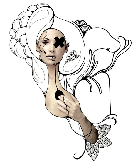
I've been most influenced by 40's and 50's American culture. The pin-up art, the war, and the golden age of hollywood. I've always been interested in vintage American commercial art, so for the project I decided to research those two decades further. My biggest artistic influences would be George Petty, Gil Elvgren, Andrew Loomis, Norman Rockwell and Geraldine Georges. Elvgren and Petty are very famous pin up artists and their style of painting appeals to me a lot. Norman Rockwell is a defining figure in American art, looking through his paintings really help me to get a feel for the 40s and 50s. Andrew Loomis is famous for the paintings he's done in advertising and also has several drawing books that i've read to help me draw in a 40s style. Geraldine does very interesting, gothic-looking digital and mixed media collages. He's inspired me for my own digital collages.
The exam trip to the Photographers Gallery didn't inspire my ideas that much because they didn't fit the theme I set for myself. Nonetheless it was interesting to see.

Geraldine Georges collage
my own work, inspired by Georges


Final Piece
For my final piece I intend to create a small zine with a vintage theme. I want to use envelopes, textured paper, and both digital and traditional collage. I also want to include my pin-up drawings, and a drawing of a 50s actor or actress to accompany the digital collage.  

Conclusion 
 I enjoyed working on the exam because I set myself a very clear theme from the beginning. I have been interested in it for a long time so researching it was very enjoyable and my drawings and collages have improved since.

Wednesday, 1 May 2013 | |


little digital experiments

George Petty analysis

Wednesday, 24 April 2013 | |


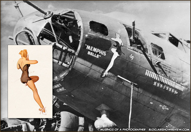
George Petty is a pin-up artist from the 1940s - 50s. His work had a major contribution to the "Pretty girl" era. He's worked for magazines such as Esquire and Playboy, and his art was widely used on airplanes as "nose art".
The pin-up is a defining art style in America in during 40s. Millions of men, most 18-20 years old, were sent off to fight in the second world war. During that time pin up girls, in both photographic and drawn form, because most popular. They were used to boost the solider's morale, and generally remind them of home.
There's several defining pin-up artists - perhaps most famously, Gil Elvgren, Rolf Armstrong, George Petty and Art Frahm. What sets Petty's work apart is his more exaggerated style.
George Petty Calendar Pin up
Gil Elvgren pin up
Pin up artists generally tend to exaggerate anatomy by making the legs longer and the waist smaller, but they still try to keep them looking realistic. Gil Elvgren is a great example of a more realistic pin-up. His oil paintings have realistic rendering and only slightly exaggerated anatomy and poses. Compared to Elvgren, Petty's girls look a lot more cartoony. They often look innocent and shy, and they have longer legs and slightly bigger heads compared to Elvgren's. His pin ups are also more simplified in terms of background and color palette. Gil usually has some kind of background to his paintings, making them have more of a narrative. Petty's paintings are stand alone, classic pin up girls. That makes Petty's work perfect for "nose art"


Nose painting means painting a picture on the side or the nose of an airplane. It was common in WW2; pilots used it to personalize their airplanes and to make them easier to recognisable for friendlies. They tend to be painted by civilian artists or other servicemen. Petty's art was perfect for it because his figures are simplified, therefor easier to draw.
His works relates to my outcome because I'm basing it on pin up art.  His style is very interesting and skilfully stylised. 


moodboard

Sunday, 14 April 2013 | |


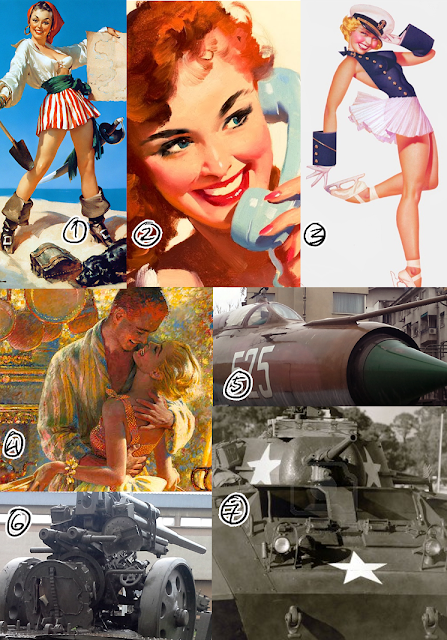
1, 2 Gil Elvgren pin ups, bright colors
3 George Petty pin ups, stylized anatomy
Edwin Georgi, pin ups with narrative, advertising and American media in the 40s
5, 6 military, weapons and aircraft, war. my own photos
7 military, tanks, war


collage experiments 2

| |


I used this photo that I took of my sister for the collages. I took several others but this one fit best, because when converted to a stencil you can still make out the features of the face. The other photos had low contrast  and were too dark or too light when adjusted.

These are all digital experiments, done in Photoshop CS5. I used this method to separate the lines from the white background. I made a layer underneath and tried different bases for the collage - plain brown for the top row, and two textures for the bottom row. In the top row I tried to experiment with color. The stripes are all cold colors, and the background is a washed out brown.
The second row is the opposite - I experimented more with the shapes; and the colors are mainly warm. The experiments were inspired by Warhol's work, particularly his Mick Jagger collages.

Wednesday, 27 March 2013 | |

This collage was created following a vintage collage tutorial.
The original image of the cowgirl is taken from an illustration of Gil Elvgren, a renowned pin up artist of the 40s and 50s. Gil's paintings are famous to this day and are an influence to lot of artists.

I cut out the girl from the background using the pen and magic wand tools in photoshop. The composition felt a bit empty with her just standing, so I added a horse in the background. I cropped the horse out of a picture I found on google. I lowered the opacity on it a bit so the focus was still on the girl.
This collage relates to what I want to do for my final piece a lot. I also want to use 40s artwork and photographs to create my collages, and I'll probably end up using this technique.

Friday, 22 March 2013 | |

1. What are your 3 initial ideas? (Explain them and include visual examples - scan your drawings!)

 I made 3 initial zines using different sized paper and some vintage photographs.


This is the plainest one I did, just experimenting with the paper and layering. The one aspect I might develop is the first page. The triangles are split on two different pages and can be used as a puzzle of sorts.
--


For this one I decided to look for a picture online and then edit it. The tractor looks old enough already so I focused on the color/mood of the photo. I explained the steps on the picture above.
When I made the booklet I thought it needed something extra, so I drew over it with a brush pen. I tried to vary the line weight and emphasis. I ended up using the same technique on the next one.
--


This booklet probably turned out best, because it combined elements from the previous two. The paper layering is more organized, but still interesting to look at, and the photo is genuine, unlike the tractor.


2. What are you planning to do to create them? Think materials, equipment, techniques...

Paper of different size, color and texture + vintage 40's-50's photographs. I'll use photoshop to edit the photos that need it. Also I might draw over them with the brush pen again.

3. Who have you researched to develop your ideas?

The "Perspective on Collage" exhibition gave me some inspiration, but mainly the photographs themselves. 
Also I researched vintage collages and found some very inspiring blogs and reference pictures.


Defrosting the cold war | Sally Edelstein
retrorama, great vintage flickr gallery

/
I also have two WW2 books of my own, mainly with pictures of aircrafts and war scenes but still useful.

4. How have you explored a range of ideas around your theme within your experiments? What are they? How have they informed your ideas?

Before the booklets I looked into the work of Geraldine Georges and did some experiments imitating his style and technique.
It was the first time I attempted to make a collage digitally. It turned out well, so I'll try using it again for other booklets.


5. Have you refined/developed your ideas through experimentation? How?

Yes, as I explained in the first question, I tested different ideas and developed the ones I liked.

6. Have you annotated, in detail, your experiments and developments in your sketchbook/blog and used this information to help you improve? (include imagery if relevant!)

I've annotated my sketchbook and also included several process pictures on my blog.


7. Which idea has been the most successful? Why?

The last zine I did was most successful because I combined the best aspects of the previous two.

8. Which idea has been the least successful? Why?

The first one, because it was the first one I did. The paper was badly arranged and too torn up, and even then it looked very plain.

9. Which idea do you think you will choose for your final outcome? Why?

I'll most likely keep the vintage theme. If I had to pick one to develop right now, it would probably be the last booklet I did - I like the old family album look. I can also draw on top of it more, make certain parts completely black  so it can fit more in the covert and obscured theme.

10. What else could you do to further develop this idea? Think techniques and experiments!

I can try adding more photos and less colored paper. I can also try drawing things on the blank paper, instead of drawing over the photos. Also I might use photoshop again to change the colors/mood of a picture; e.g. take a color photo and make some parts black and white.

| |


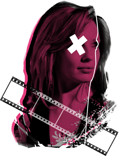
1. Original photo of an actress, off google
2. Turned it black and white, turned up the contrast
3. Turned up the contrast more. Looked at some of Geraldine's artwork and edited the image to fit his style (rougher edges, floral motives)
4. Continued adding things. Covered eyes are a recurring pattern in his art
5. Hot pink layer on multiply and 85%


Thursday, 7 March 2013 | |


1. Briefly explain the exhibition info, i.e. who was exhibiting? Where was it?
The exhibition's name is "Perspective on Collage", and it was exhibited in The Photographers Gallery, Soho. 

2. Include photographs that you have taken yourself at the exhibitions


3. Find some information about the artists/designers you liked - find information on the internet and in your exhibition guides/leaflets you collected

I liked Anna Parkina's work. She's a russian artist, born in Moscow in 1979. She's had a lot of exhibitions around the world and her work is pretty well known.

Roy Arden is a canadian artist born in 1957. He's taught photography is vancouver and is currently a guest teacher in germany. 

4. Select your 2 favourite pieces of work and write about them explaining what they were about and why you liked them

Roy Arden's "Sweeper" was interesting to hear about. I liked it because the artist sweeped up the trash from his floor and put together a collage. A method you wouldn't normally think of using, so he's thinking out of the box.

sweeper

I also liked Anna Parkina's collage, untitled 6. It's very creative and looks, at first glance, very organised. When you look at the picture carefully however, you'll notice a lot of interesting details. It took me a while to figure out what the base picture was.
untitled 6


5. Select your 2 least favourite pieces of work 
I disliked Clunie Reed's work, because it was too random and a bit pointless. It was surpring to see them in a photography gallery. It was surprising to see them in any gallery.


clunie reed


6. Conclude with a paragraph about the overall impression of the exhibition.  Did you enjoy it? Has it given you ideas and inspiration for what you might study at University? or as a career? How relevant was it to your exam project? What ideas will you take forward in your own work? etc. 

I  


Thursday, 28 February 2013 | |


These are some more experimentation with digital collage.  
1. original image, touched up brightness/conmtrast
2. image -> adjustments -> threshold to make it into a stencil.
window -> channels, select Blue, then click on the circled button (load channel as selection)
3. back to layers, double click background layer to convert to a normal layer. click delete to remove the white of the background
4. color on a new layer below the stencil

I like this technique because it's very versatile. You can take the stencil as a line art and pay on top or underneath it. I used the lines on the examples above to put in some more colors. A way to achieve the same but with traditional materials, would be to draw the silhouette on top of a collage.

second illustration analysis

Saturday, 23 February 2013 | |


Cover art for "The Rider" by Frank Frazetta.

For this analysis I've chosen my own artist, mainly because I couldn't find anything on the one named on the blog. I've also been meaning to look at Frank Frazetta's work for a while - I think his work relates nicely to the theme (covert and obscured).
Frank Frazetta (1928 - 2010) was an American fantasy artist. He's worked in a lot of different media, including paperback book covers, comic books, paintings and posters. He's a very famous American artist and has a lot of influence on modern fantasy art. 
The painting I picked to analyze is cover art for a book by Edgar Rice Burroughs. Frank and Edgar frequently collaborated for books, perhaps the most famous example being the original Tarzan covers.

There's several elements to Frank's style that made it appealing to book and comic authors. He has a very strong sense of composition. Depending on the book, the key subject is always in the center, always in their element. For example, both of Tarzan's covers show exactly what he and the book is about, so that the consumer knows exactly what they're getting. However they're also intrigued - another notable quality that Frazetta's work has is it's sense of movement. When he depicts figures it's usually in an epic and dramatic matter, like in the middle of a battle - his work always has impact.

                                          
The dynamic figures are a key part of Frazetta's work, but his use of color is a huge factor as well. In his more "epic" paintings he uses more vibrant reds, yellows and blues. When the cover needs to be more mellow his colors appear to be more washed out but still have good contrast. In the very first picture I picked, you can clearly see he was going for a more moody and dark mood. The dominant color is black and the parts that are emphasized are the rider's pistol and his mask.
Most of Frank's work focuses on figures in action, however he has no issues drawing different subject matter.

                                          
I like Frank Frazetta's work a lot, that's why I chose to analyze him. Even though I'll be making a magazine cover for my final outcome, I can learn a lot from his artwork.


Powered by Blogger.