final
Sunday, 27 January 2013 | Posted by hedgie at 12:54 |
Monday, 21 January 2013 | Posted by hedgie at 11:47 |
front cover planning
for the final image I changed the girl and lightened the background a bit
all of the fonts I've used are ones that I used inside the magazine - they link to specific articles
also decided not to cram too much text onto the page, this way the viewer pays equal attention to the illustration and titles
| Posted by hedgie at 09:47 |
logo
progress
these are some concepts for the logo, mainly the same thing from different positions and angles
drawn with non-photo blue pencil, markers and black pen
Wednesday, 16 January 2013 | Posted by hedgie at 15:55 |
photography spread
Tried making it more sleek and formal, in contrast to the illustration spread. The color palette is intentionally limited, to the point where I edited my own photo again to give it a blue tint.
fonts: justus (header) , foglihten (sub-header) , forgotten futurist (main body)
Tuesday, 15 January 2013 | Posted by hedgie at 15:07 |
illustration spread
this(x) is the tutorial I used to make the smudge brush. I usually use it while painting, but it worked great to create the watercolor effect. Unfortunately, it only works with a pressure sensitive tablet
This is the final spread. I've picked the colors from the illustrations for each artist to make a gradient. The font I used for the names is crime times six, ebrima for the main text, tommy hilfiger AF for the header and the "January" is hand written.
Monday, 14 January 2013 | Posted by hedgie at 06:21 |
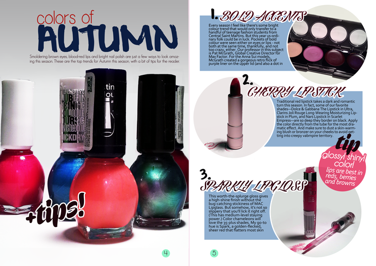
feature spread and process
I had a pretty basic light set up, I don't do photography and I really haven't read much about it on my own
Essentially, I clipped a table lamp to my monitor, hoping neither would break somehow (they didn't) and bent the lamp. I could've used a second light source but since I didn't have a second lamp around I just edited out what I didn't need in photoshop
I had a couple of magazines I used as inspiration:
I thought I only took the round pictures idea from this spread, but looking back I suppose I also snatched the basic layout for the second page
I liked this one because there was a nice use of fonts. It also just looks like a conventional make-up article, with it's photos of a variety of products and crumbled eye shadow.
final spread
A big picture on the first page, usually a close-up of an eye or product is a typical way to start a make-up article.
fonts:
geo sans font (subheader) , simplicity font (colors of) , corbel (main text)
Subscribe to:
Comments (Atom)
Powered by Blogger.


