Interpreting the theme
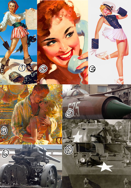
I wanted to experiment with paper and create a small zine with a vintage theme. I planned to focus on the more glamorous part of the 40s and 50s, like the pin-ups and hollywood actors and actresses. The glamorous image of the 40s and 50s often obscures the war and economical situation at the time.
I wanted to create a vintage, 50s related zine, so I plan to include envelopes and family photographs. Envelopes are obscuring the contents inside, and photographs have a different meaning to myself that is hidden and unknown to others.
Recording observations
I recorded my observation in my sketchbook and digitally on my blog. I made a lot of experiments with different materials traditionally in my sketchbook. I used photoshop for my digital experiments with collage.
Idea development
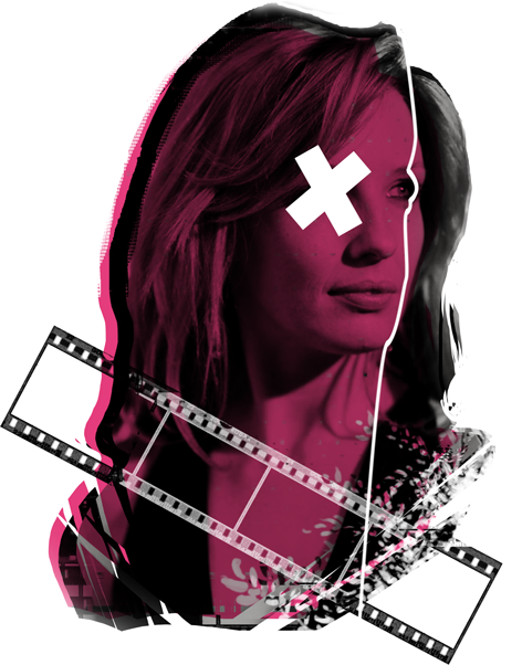
Because I wanted my zine to be interesting to look at, I wanted to use a variety of techniques and materials. The idea I developed the furthest is my pin-up drawings. I copied a lot of pin up paintings and drawings, which helped me a lot to draw more freely in that style. Another idea I had was to create digital collages in photoshop with portraits of actors and actresses from the 50s. I took a lot of black and white photos and added colorful geometric shapes. It's quite simple but very effective when used with the right colors. An idea I discarded was to put tracing paper over photographs and draw on top of them. I experimented with it a lot, using different mediums to draw like pencil, marker and ink, but it didn't look as good as I wanted it to be.
Materials, Techniques and Processes
I've used a wide variety of materials in my sketchbook. I've used pencil, watercolor, marker, ink, marker and charcoal. I've combined them most of the time. For example I've used ink to add outlines after a watercolor drawing has dried. I've also done a lot of digital collages in photoshop. I started out by only adding triangles and other shapes around the person's eyes, but for my final piece I plan to draw bigger shapes. I'm more comfortable with photoshop, but because I practiced a lot with watercolor and pencil I'm much more comfortable with traditional mediums now too.
Influences
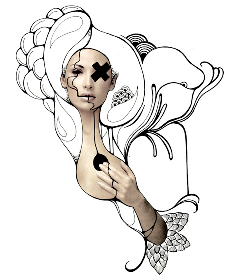
I've been most influenced by 40's and 50's American culture. The pin-up art, the war, and the golden age of hollywood. I've always been interested in vintage American commercial art, so for the project I decided to research those two decades further. My biggest artistic influences would be George Petty, Gil Elvgren, Andrew Loomis, Norman Rockwell and Geraldine Georges. Elvgren and Petty are very famous pin up artists and their style of painting appeals to me a lot. Norman Rockwell is a defining figure in American art, looking through his paintings really help me to get a feel for the 40s and 50s. Andrew Loomis is famous for the paintings he's done in advertising and also has several drawing books that i've read to help me draw in a 40s style. Geraldine does very interesting, gothic-looking digital and mixed media collages. He's inspired me for my own digital collages.

The exam trip to the Photographers Gallery didn't inspire my ideas that much because they didn't fit the theme I set for myself. Nonetheless it was interesting to see.
 |
| Geraldine Georges collage |
 |
| my own work, inspired by Georges |
Final Piece
For my final piece I intend to create a small zine with a vintage theme. I want to use envelopes, textured paper, and both digital and traditional collage. I also want to include my pin-up drawings, and a drawing of a 50s actor or actress to accompany the digital collage.
Conclusion
I enjoyed working on the exam because I set myself a very clear theme from the beginning. I have been interested in it for a long time so researching it was very enjoyable and my drawings and collages have improved since.


