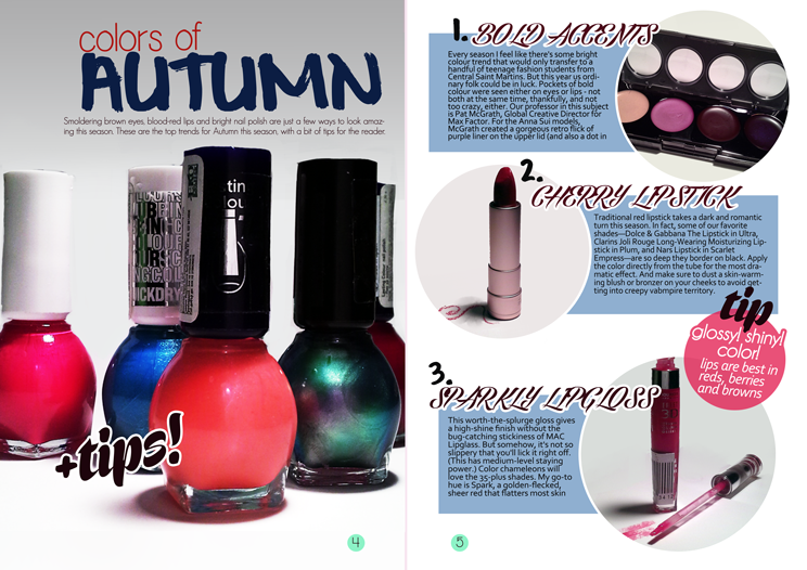
feature spread and process
I had a pretty basic light set up, I don't do photography and I really haven't read much about it on my own
Essentially, I clipped a table lamp to my monitor, hoping neither would break somehow (they didn't) and bent the lamp. I could've used a second light source but since I didn't have a second lamp around I just edited out what I didn't need in photoshop
I had a couple of magazines I used as inspiration:
I thought I only took the round pictures idea from this spread, but looking back I suppose I also snatched the basic layout for the second page
I liked this one because there was a nice use of fonts. It also just looks like a conventional make-up article, with it's photos of a variety of products and crumbled eye shadow.
final spread
A big picture on the first page, usually a close-up of an eye or product is a typical way to start a make-up article.
fonts:
geo sans font (subheader) , simplicity font (colors of) , corbel (main text)


1 comments:
Please annotate your development to fully explain your thought process and upload the rest of your feature development so far so that I can see how your design is developing.
Post a Comment